What I did
- UX Design Workshop
- UX Design
- UI Design
- Mockup
Supply Chain App
Note: The images presented in this process are recreations of the artifacts I designed for a particular enterprise design process. The original works cannot be shown due to confidentiality reasons. While the user cases and solutions are fictional, they follow the same processes I lead while working on the real project.
As a part of the UX team, I planned and lead UX workshops across multidisciplinary teams. I also helped to define main users, task analyses, creation of user flows, prototypes, and high-fidelity mockups.
The problem
Design an app to move inventory through different operators. The app should be easy to learn, with a low cognitive load, allowing users to see at a glance current inventory. The main challenge was that we didn't have access to the final user, and every team involved in the development of the product had misconceptions of the market fit for the app and the main purpose of the product.
Defining Usability Goals
I, as a part of a UX team, planned and ran a workshop about design ideation across teams to foster a user-centered design approach. One of the activities was to identify apps that we used often and classify some of their features into different usability criteria. From that workshop, we defined usability parameters such as:

Building Empathy For Users
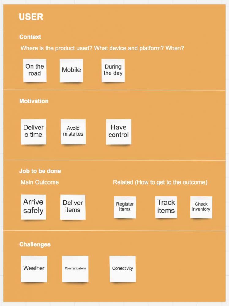
During the workshop, we tried to define our users as we thought they would behave and feel. The main goal of these workshops was to onboard engineers and product managers into the design process, to help them understand and empathize with the end users of the product, thereby validating or correcting various assumptions about our customers.
Four criteria were established to build the personas:
- The context where the persona uses the app
- His/her motivation
- Jobs to be done
- His/her challenges
From this exercise, the team was able to agree upon the main functionalities for the MVP that could help users to achieve their goals.
Defining Objects and Actions
In order to create a conceptual model that included terminology familiar to the users of the app, we as a team defined which elements were objects, and what actions could be performed on those objects. Some of the findings were:
- Actions that were common through the app were named differently in every object (ex: erase = delete, transfer = send), causing confusion among users, making it harder to learn the platform.
- Same objects changed their name in different tasks inside the app.
- Some actions were never used although they were present in the app.

Storytelling
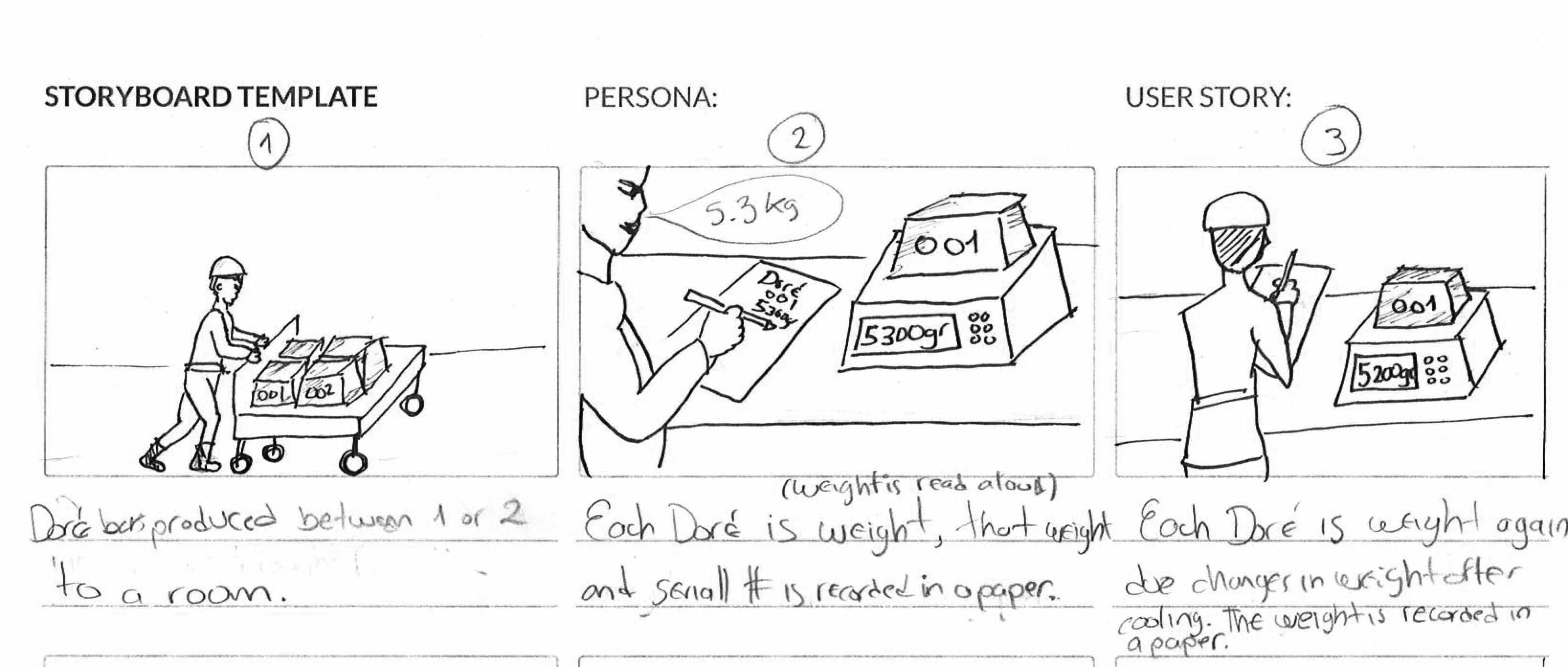
Based on a contextual inquiry done by the product manager, I sketched all the processes and steps that users would go through to achieve their goals. With these storyboards, the UX team wanted to validate the conceptual model I created in the previous steps to understand where our solution alleviated pain points and added extra work for the user. The storytelling method allowed us:
- To walk the users' shoes visualizing their needs.
- Helped us to conceptualize the design before wireframing.
User Flows
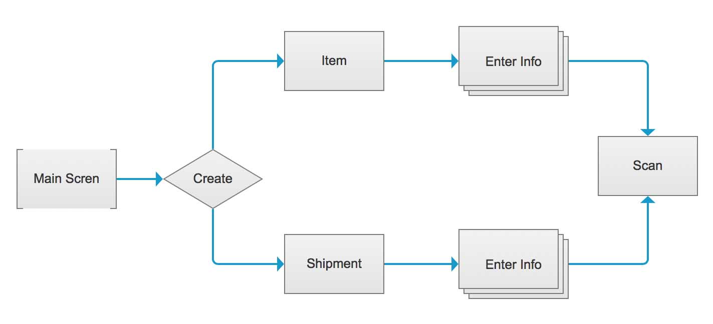
Our UX team discussed and developed user flows for every critical task. We aimed to answer questions such as: What did the user want to accomplish? Could they do it through the app's interface with minimum or no friction?
Sketches
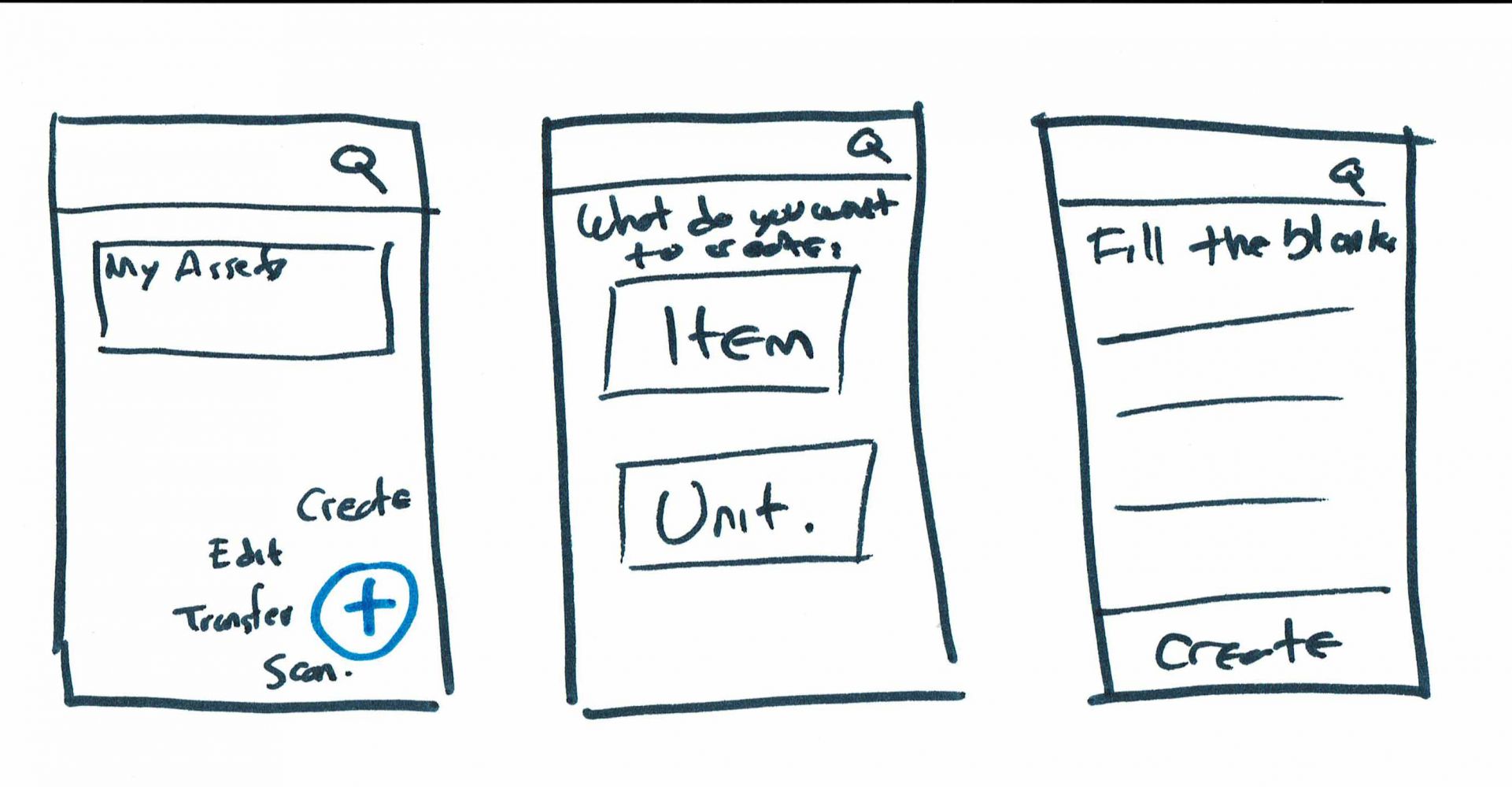
I created a series of sketches to convey facts and insights from the UX workshops, the contextual inquiries, and the conceptual model definition that was developed. From this exercise, we synthesized ideas and moved forward to create low-fidelity wireframes.
Wireframes
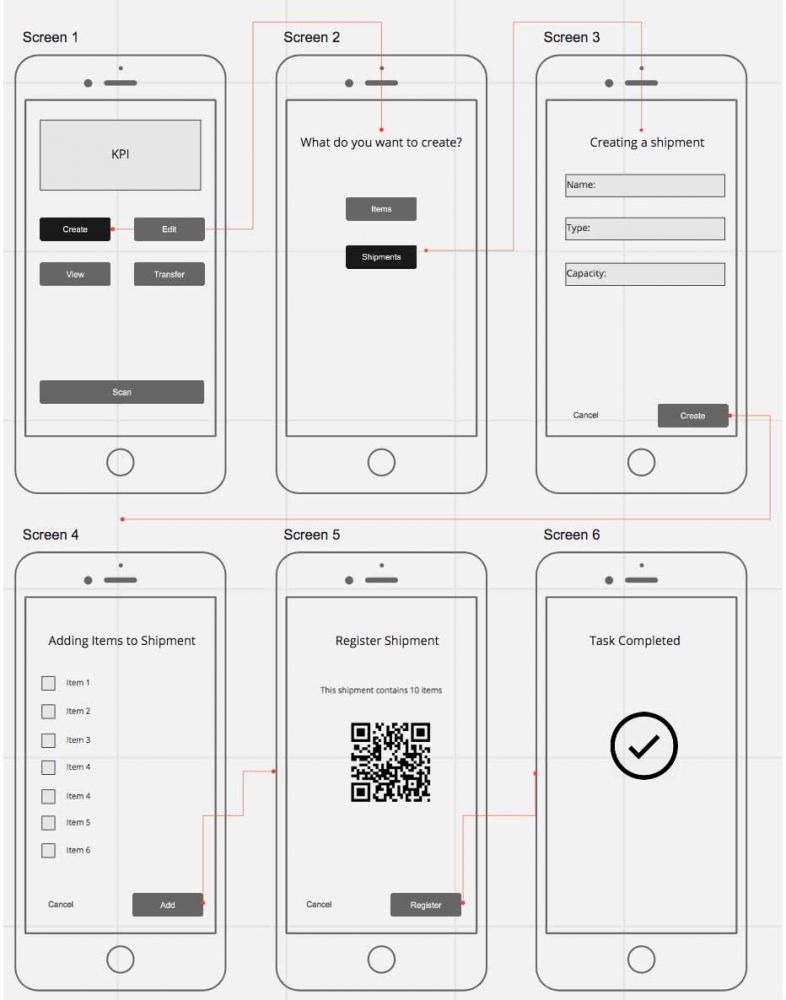
Low-fidelity wireframes then allowed us to have more productive discussions with product managers and developers. Based on their input, before investing further time in high-fidelity mockups , I refined the idea, iterated, and presented new wireframes. Once a clear concept was formed, I was then able to design perfect pixel designs.
High-Fidelity Mockup
Design To Help Users to Reach Goals
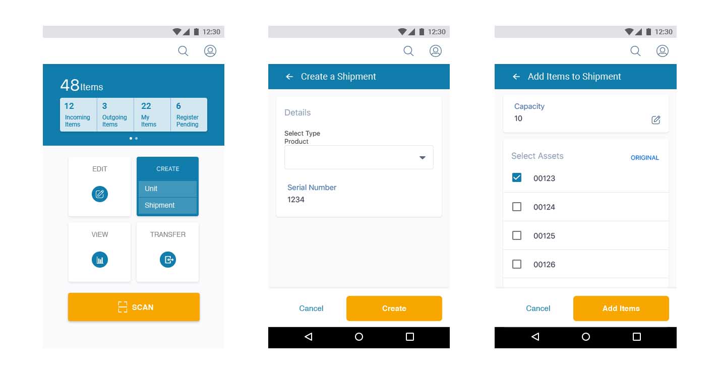
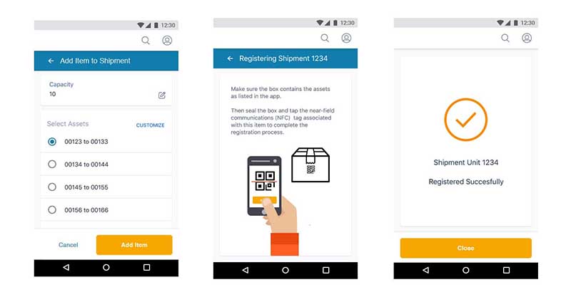
Users want to achieve goals instead of learning complicated systems. I was in charge of creating a final design based on actions that mapped as closely as possible the user's mental model.
The following images are what I considered would be the best approach for this supply chain solution, which presented the user with an app that allowed him/her to initiate a workflow with actionable elements displayed on the screen. For example, the user opens the app in order to create a new product or shipment in the system, edit an existing one, view his/her current inventory, or transfer a product or shipment to the next player in the chain.
What I Learned Working On This Project
Sometimes teams in a company can be disconnected and work in bubbles without seeing the big picture. We, as humans, also sometimes allow our own cognitive biases to take precedence instead of the user's needs for the product. Our UX team struggled to connect with engineers and developers, and many stakeholders had his/her own opinions about the right approach in designing the application. To help solve these issues, I came up with the idea of using UX workshops. These workshops involved the product management and development teams, to include and lead them, and our company, towards a more user-centered design process.
Thanks to the support I received from our UX team leader, I was able to plan and schedule two sessions for this participatory workshop. Many productive ideas came from this exercise, and we were able to align our teams better, and build a product which fulfilled user needs, instead of simply meeting our own personal assumptions.
Some Resources I Used For This Project
I consulted various articles and texts to get ideas on how to approach UX design among teams, and the best way to design a solution when there is no access to users. Some of the books and websites I used are below.

